What Makes a Watch Look Expensive? 9 Design Details Buyers Notice First
A watch does not need to be expensive to look expensive.
That is one of the first things buyers learn once they stop shopping only by brand name. Some watches cost a lot and still look visually confused, oversized, or oddly cheap on the wrist. Others cost far less but immediately feel refined, balanced, and premium from a few feet away.
That difference is rarely about one single feature.
It is usually the result of a handful of design choices working together: the thickness, the proportions, the dial layout, the bracelet fit, the crystal shape, the finishing, and the overall restraint of the watch. In other words, what makes a watch look expensive is not just what the watch has. It is how well the watch edits itself.
That is why this topic matters for real buyers.
A lot of people think they are shopping for brand prestige, but what they are actually reacting to is visual coherence. They want a watch that looks considered, mature, and quietly premium. They want something that feels elevated without looking desperate to prove it.
So if you have ever looked at two watches with wildly different prices and thought, “Why does the cheaper one somehow look more expensive?”, this is the reason.
Quick answer
A watch usually looks expensive when it has balanced proportions, clean dial organization, controlled finishing, a well-integrated bracelet or strap, a refined case thickness, and a design that feels intentional rather than overloaded. Expensive-looking watches rarely scream. They usually look calm, precise, and easy on the eye. In most cases, what makes a watch look premium is not excess. It is discipline.
Why some watches look premium before you even know the price
The human eye notices coherence very quickly.
You may not consciously say, “The rehaut is well judged” or “The visual weight of the bezel is balanced against the dial opening,” but you still react to those things. A watch that looks expensive usually feels visually settled. Nothing fights for attention. The shapes work together. The case does not feel clumsy. The dial does not feel crowded. The bracelet does not look like an afterthought.
This is exactly why so many buyers slowly move away from flashy spec-sheet shopping. The longer people spend around watches, the more they realize that expensive-looking design is often about proportion and restraint rather than obvious complexity.
That also explains why some of the best daily watches look so convincing in person. They are not necessarily the most dramatic. They are just extremely well resolved. If you want the practical version of that idea, Best Everyday Automatic Watch Features: 8 Specs That Matter More Than Marketing is a useful companion, because the watches that look expensive and the watches that wear well often share the same discipline.
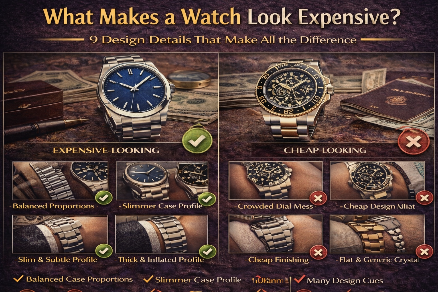
1) Good proportions make a watch look more expensive than almost anything else
This is the biggest one.
A watch can have sapphire crystal, an automatic movement, applied markers, and a strong brand name, but if the proportions feel off, it will still look cheaper than it should. Case diameter, lug length, bezel width, dial opening, and thickness all affect whether a watch looks refined or awkward.
Expensive-looking watches usually feel balanced at a glance. The dial is not swallowed by too much empty metal, and the bezel is not so thick that it makes the watch feel toy-like. The lugs do not stretch too far past the wrist. The case has enough presence, but not so much that it feels inflated.
This is why buyers often confuse “larger” with “more premium” early on, then slowly realize the opposite can be true. A well-proportioned 36mm or 38mm watch often looks more expensive than a bloated 42mm watch that is trying too hard to feel important.
That is also why Automatic Watch Size Guide: 36mm vs 38mm vs 40mm vs 42mm — What Actually Fits Your Wrist? matters so much here. The watch that looks expensive on your wrist is usually the one that fits properly, not the one that dominates it.
2) Slimmer case profiles almost always read as more refined
Thickness changes the whole personality of a watch.
A thick watch can look rugged, technical, or sporty, which may be exactly the point. But if your goal is “expensive-looking” in the more elegant, mature sense, excessive thickness usually works against you. It makes the watch feel heavier visually, more aggressive under a cuff, and often less sophisticated overall.
A lot of buyers do not notice this at first because online photos flatten the case. In real life, thickness is one of the first things people register. A watch that sits lower and cleaner on the wrist often looks more expensive because it feels more resolved.
This does not mean every expensive-looking watch must be ultra-thin. It means that thickness should feel intentional. When it does not, the watch often starts to feel chunky rather than premium.
That is exactly the difference explored in Automatic Watch Thickness Guide: Why 11mm Feels Elegant and 14mm Feels Sporty. Buyers who want a watch to look more expensive almost always benefit from understanding that trade-off.
3) A clean dial almost always looks more premium than a crowded one
One of the fastest ways for a watch to look cheap is visual overload.
Too much text, too many colors, too many scales, too many cutouts, too many design cues fighting for attention — all of that makes a watch feel less expensive, even when the parts are individually good.
Expensive-looking watches usually have calm dials. That does not mean boring. It means organized.
The logo is not too large. The text does not feel desperate. The markers, hands, and dial surface work together instead of competing. Even when the watch has complications, there is still some sense of visual hierarchy.
This is why buyers who want a more premium look often end up leaning toward no-date or simpler dial layouts, especially if they are deciding between practical detail and visual calm. The design logic behind Date Window vs No-Date Watch: Which One Is Better for Everyday Wear? matters here too, because a date window can either make a watch feel usefully complete or slightly interrupt the symmetry that made it look expensive in the first place.
4) Finishing matters, but contrast matters even more
When people talk about finishing, they often think only of polish.
That is not enough.
A watch looks expensive when its surfaces are thoughtfully contrasted. Brushed areas, polished edges, sharp transitions, and controlled reflections do more for the luxury feel than simply making the whole case shiny. Too much uniform polish can actually make a watch look cheaper, because it starts to feel loud instead of precise.
The expensive look usually comes from restraint and definition. You notice that the case lines are clean. The edges are intentional. The bezel catches light in a controlled way. The watch does not sparkle randomly. It reflects light where it is meant to.
This is one reason some watches feel premium in person but not in product photos. Their value comes from light behavior and surface transition, which the camera does not always capture well.
5) The bracelet or strap can make the whole watch look cheaper or better
A lot of buyers focus so much on the watch head that they forget the part that actually frames it on the wrist.
That is a mistake.
A watch can have a beautiful dial and a good case, but if the bracelet looks stamped, too shiny, poorly integrated, or visually flat, the whole watch loses some of its expensive feel. The same goes for a strap that looks plasticky, stiff, or wrongly matched to the case.
A premium-looking watch usually has one of two things:
- a bracelet that feels integrated and architecturally consistent with the case, or
- a strap that looks like a deliberate style decision, not a budget compromise
This is exactly why strap choice changes so much. Leather vs Bracelet vs Rubber Strap: How Strap Choice Changes Fit, Style, and Value is directly relevant here, because the same watch can look elegant on leather, sporty-premium on bracelet, or much less refined on the wrong rubber strap.
And if you are deciding between a bracelet-first watch and a strap-first watch as your main piece, Bracelet Watch vs Leather Strap Watch: Which One Is Better as Your First Automatic? helps frame that choice in real ownership terms, not just aesthetics.
6) Crystal shape changes the perceived price more than most people expect
A surprising number of buyers only start noticing crystal design after they have seen enough watches in person.
But once you see it, you cannot unsee it.
A well-judged domed crystal can add softness, richness, and a more considered profile. A flatter crystal can look cleaner, sharper, and more modern. Neither is automatically better, but the crystal has to match the watch.
If it does not, the whole design starts to feel mismatched.
A watch looks expensive when the crystal works with the dial and case rather than just covering them. That is why Domed vs Flat Sapphire Crystal: Looks, Legibility, Durability & Which to Choose matters more than it first seems. Crystal shape is one of those small design choices that quietly changes whether a watch feels premium, vintage-inspired, sleek, sporty, or slightly generic.
7) The best expensive-looking watches know how to use less
This is where design maturity shows up.
A lot of cheap-looking watches are not actually cheap because they lack features. They look cheap because they keep adding things: extra colors, extra texture, extra lines, extra fonts, extra complications, extra branding. The watch starts trying so hard to look premium that it stops looking premium.
Expensive-looking watches often take the opposite approach. They use fewer ideas, but execute them more confidently.
This is why some of the most luxurious-looking watches have only two or three visual moves:
- a well-sized case
- a balanced dial
- a strong bracelet or strap
- maybe one refined texture or one polished detail
That is enough.
The principle is simple: when a watch does not need to prove itself with noise, it often looks more expensive.
8) Material feel matters, but perceived quality matters more than the label
Titanium sounds advanced. Steel sounds traditional. Ceramic sounds luxurious. But the material alone does not decide whether a watch looks expensive.
Perceived quality does.
A brushed steel watch with excellent case lines can look more expensive than a poorly designed titanium watch. A titanium case can feel very premium when the lightness and finish support the design, but if the visual language is too flat or the case looks underdefined, the material name does not save it.
This is why Titanium vs Stainless Steel Watches: Weight, Comfort, Durability & Which One Feels Better Daily matters in a design conversation too. What buyers often call “expensive-looking” is partly visual and partly physical. The watch needs to look refined, but it also needs to feel coherent when worn.
A watch that looks expensive but feels oddly hollow or imbalanced loses some of that illusion very quickly.
9) Watches look expensive when they feel believable on the wrist
This is the final point, and it may be the most important.
A watch looks expensive when it looks like it belongs on the person wearing it.
That means the size is believable, the style fits the wardrobe, the case shape suits the wrist, and the overall look feels natural rather than forced. An oversized gold-tone sports watch on a small wrist can look less expensive than a modest steel dress watch that fits beautifully and matches the wearer’s style.
This is why expensive-looking design is never only about the object itself. It is also about context.
A real-world example makes this clearer. Two buyers each spend similar money. One buys a very large, over-styled watch with a thick case, bright blue dial, oversized markers, and a flashy bracelet because it looked impressive online. The other buys a simpler steel watch with a balanced 38mm case, a restrained dial, a strong bracelet taper, and a cleaner crystal profile. In person, the second watch almost always looks more expensive, even if the brand is less famous.
That is because expensive-looking watches usually feel believable, not performative.
A buyer example: why one watch looked “luxury” and the other did not
Imagine a buyer choosing between two everyday watches around the same budget.
The first has a skeleton-style dial, thick case, shiny center links, oversized case diameter, and multiple colors on the bezel. On paper, it sounds packed with features. In photos, it may even look exciting.
The second has a clean dial, slimmer mid-case, stronger proportions, a calmer bracelet finish, and a more restrained color story. On paper, it may even sound less interesting.
But on the wrist, the second watch usually wins.
Why? Because it looks edited. It feels like someone decided what mattered and removed the rest. That is what buyers often mean when they say a watch “looks expensive.”
They are not praising the price. They are praising the judgment.
How to make a watch look more expensive without spending more
This is the useful part for real buyers.
If you want a watch to look more premium, you do not always need a new brand or a bigger budget. Sometimes you just need better choices.
You can usually improve the expensive look by:
- choosing a better size for your wrist
- avoiding over-thick cases unless you genuinely want a sportier feel
- favoring cleaner dials over crowded ones
- selecting black, silver, white, or dark blue before louder colors if versatility matters
- moving from a weak bracelet to a stronger strap, or vice versa
- choosing a more restrained case finish and design
- avoiding watches with too many “luxury signals” stacked at once
That is also why Black Dial vs White Dial Watch: Which One Is More Versatile for Everyday Wear? matters in this conversation. Buyers often underestimate how much a dial color affects perceived refinement. Darker, calmer dials usually make it easier for the rest of the watch to feel cohesive.
The role of brand: yes, it matters — but less than people think
Of course brand affects how expensive a watch looks.
A famous luxury logo creates expectation before the watch even gets judged. But brand is often doing less of the actual visual work than buyers assume. A poorly designed luxury watch can still look disappointing. A well-designed affordable watch can still look elevated.
That is why people sometimes react strongly to a watch before they know what it is. They are responding to shape, balance, finishing, and confidence of design more than to the logo itself.
Brand can confirm the impression. It does not always create it.
Final verdict
A watch usually looks expensive when it feels calm, balanced, and intentional.
Not oversized.
Not overdecorated.
Not overloaded with features trying to prove something.
The expensive look usually comes from proportion, restraint, finishing, dial discipline, and a bracelet or strap that truly belongs with the watch.
That is why buyers who want a more premium-looking watch should stop asking only, “What brand should I buy?” and start asking better questions:
Does the size fit my wrist?
Is the dial clean?
Is the thickness helping or hurting the design?
Does the bracelet look integrated?
Does the watch feel edited or crowded?
In the end, expensive-looking watches do not usually win by doing more.
They win by knowing exactly what to leave out.
FAQ
Do expensive watches always look expensive?
No. Some expensive watches still look visually busy, oversized, or poorly balanced. Price and premium appearance are related, but they are not the same thing.
What dial color makes a watch look most expensive?
Usually black, silver, white, and deep blue are the easiest colors to make look refined and versatile. But proportion and finish matter more than color alone.
Do smaller watches look more expensive?
Not automatically, but well-proportioned watches often look more expensive than oversized ones. Fit and balance matter more than sheer size.
Does a bracelet make a watch look more premium than a strap?
Not always. A great bracelet can elevate a watch, but a poor bracelet can cheapen it fast. A good leather strap can often make a watch look more refined than a weak bracelet.
What is the biggest mistake that makes a watch look cheap?
Usually too many design ideas at once: oversized case, too much text, too many colors, too much shine, or a dial that feels crowded and unedited.
